The Business Card Is Small. The First Impression Isn’t.
A strong card does one job beautifully: it makes the next conversation easy to start.
Filed under Branding. Practical notes from Baer Paw Marketing for businesses in North Idaho and beyond.
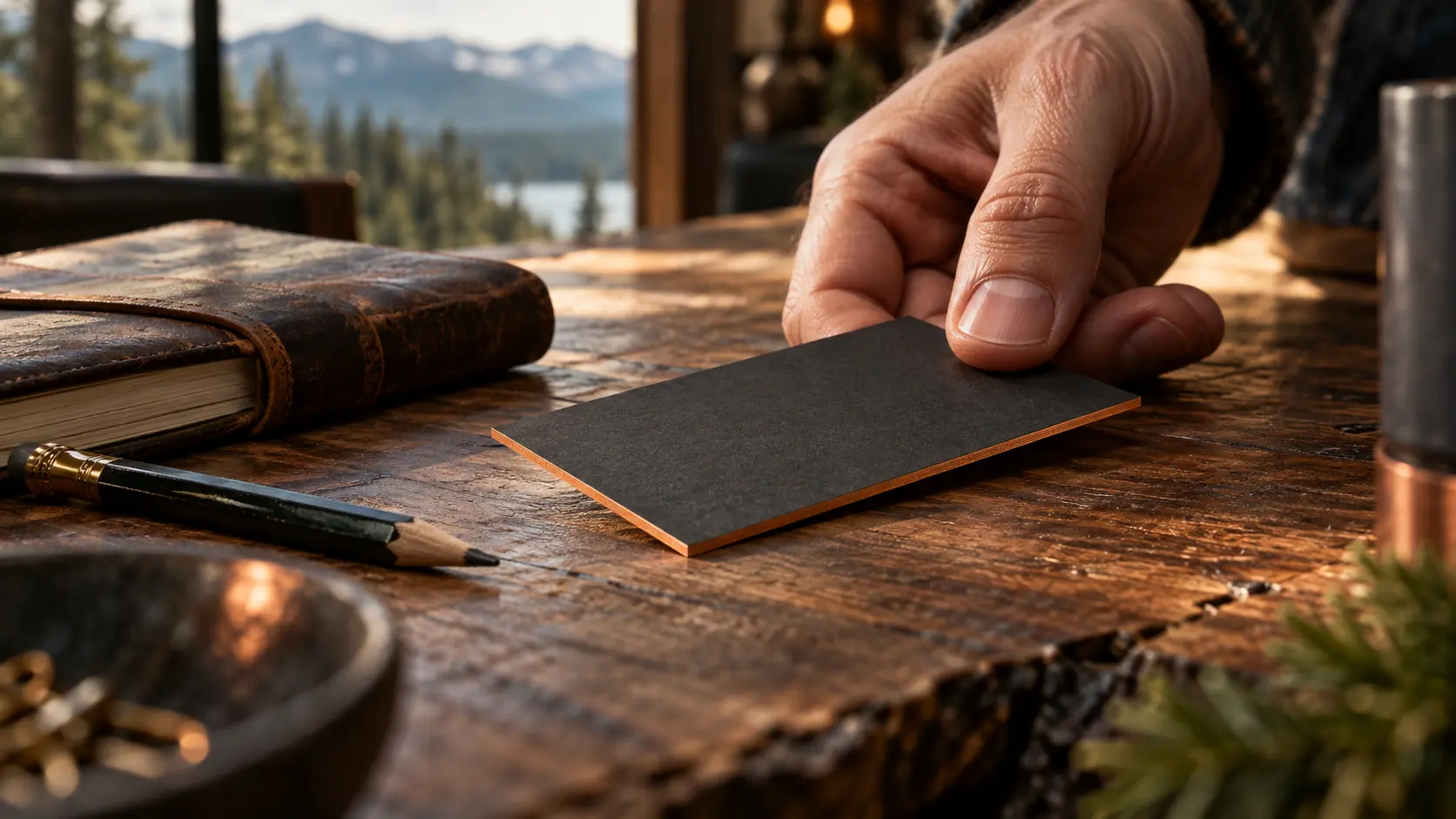
A pocket-size handshake
A business card can outlast the conversation at a job site, market, or coffee counter. The goal is not to cram in every service. The goal is to help someone remember who you are and reach you without guessing.
What belongs on it
Use a readable business name, one plain-language description of what you do, a reliable contact method, and your website. If you serve a particular area, “Serving North Idaho” may do more work than another decorative flourish. Check the phone number and URL twice before printing.
Make the physical and digital feel related
The orange on the card should not become an unrelated blue on the website. A consistent mark, voice, and visual rhythm make the handoff from the card to the site feel intentional. A great card is not a substitute for a website; it is a bridge to it.
The QR-code decision
A QR code can take someone directly to a portfolio, booking page, or contact form, but include a human-readable URL too. Test the code on more than one phone before ordering a stack. If the destination might change, use a URL you control so the printed card remains useful.
A practical print check
Print one at actual size. If the smallest text requires squinting or the QR code competes with your phone number, simplify. The most expensive card is the one nobody can use.
Sources & further reading
Google Search Essentials (clear, descriptive text): https://developers.google.com/search/docs/essentials